Top Tips for a Killer White Paper Design
My team at Gosling Media and I have been designing White Papers and other forms of B2B content for more than 15 years and while all pieces of high-quality content differ, I have developed a strong understanding of what good looks like. This guide is designed to help you identify ways to improve your long-form content and ensure the target audience takes away a positive impression of your brand and a clear understanding of your topic.
If you want to chat about this topic (or anything else), you can find me on LinkedIn here!

Pete Gosling
Principal, Gosling Media
Wait, what even is a white paper?
It’s an overused term and often interchanged with ebooks, guides, and reports, but what is the actual meaning?
The term “white paper” originated in the British government in the early 20th century, where it was used to describe a formal government report. These documents were often bound in white covers, which led to their name. In the following decades, the term was adopted by other organizations and industries, including the technology sector. Today, white papers are commonly used in B2B marketing to present detailed analyses and recommendations to potential customers. However, the name “white paper” continues to be used to describe these documents, which typically have a formal, persuasive tone and are designed to be an authoritative source of information on a particular topic.
This article is for the lead-generating, content marketing forms of White Papers and ebooks!
The benefits of producing a white paper
White papers are a popular form of content marketing. They offer companies a chance to go in-depth on specific topics and showcase their knowledge and expertise. Like we’re doing now! In addition to building credibility, marketers use white papers to generate leads and persuade potential customers. A well-crafted document can help establish thought leadership, educate your target audience, differentiate your brand from competitors, and present complex ideas in a more digestible format. Whether you’re creating your first white paper or looking to refine your approach, these benefits underscore the value of this powerful marketing tool:
- Establishing thought leadership: White papers allow a company to demonstrate its expertise in a particular area, building trust and credibility with potential customers.
- Generating leads: By offering a valuable resource, white papers can be an effective lead generation tool for companies, capturing contact information from interested readers.
- Educating target audience: White papers allow a company to educate potential customers on a specific topic, providing in-depth analysis beyond what could be covered in a blog post or social media update.
- Providing a persuasive presentation of complex ideas: White papers can effectively present complex ideas or data in a more digestible, clear format, breaking down complicated concepts into more easily understood sections.
- Differentiating from competitors: Depending on your industry, white papers can be relatively rare and thus can help your company stand out from competitors who may rely primarily on blog posts, case studies, and other forms of marketing collateral.
Overall, a white paper can help a company establish itself as an authority in its industry, educate potential customers, and generate leads, all while presenting complex ideas in a clear, well-designed manner.
The importance of good white paper design
Design plays a crucial role in creating an excellent white paper for several reasons:
A well-designed white paper can capture the reader’s attention, making it more likely that they will engage with the content. By creating an attractive and visually appealing design, companies can make a solid first impression on potential customers, increasing the likelihood that they will continue reading.
Good design choices, such as charts, graphs, or other visual aids, can help break up large blocks of text within the white paper. These elements can make the document easier to read and understand, improving the overall quality of the content.
A well-executed design will reinforce a company’s branding, ensuring that the white paper’s design elements are consistent with other marketing collateral.
By creating a cohesive look and feel across all materials, companies can establish a strong brand identity and develop a sense of trust with potential customers.
The Anatomy of a White Paper
High quality white papers typically include:
- Cover page: A professional and eye-catching cover page that includes your company logo and the title of the white paper.
- Table of contents: A clear and organized table of contents that provides an overview of the sections and sub-sections in the white paper.
- Introduction: A brief introduction that explains the purpose of the white paper and sets the tone for the rest of the document.
- Body: The white paper’s main content should be divided into sections and sub-sections. Use clear and concise language, and include data, statistics, and examples to support your arguments.
- Design elements: Use visual aids such as graphs, charts, or images to enhance the white paper’s overall presentation.
- Conclusion: A summary of the white paper’s key points and a call-to-action or next steps for the reader.
- Author information: Include information about the author or authors of the white paper, such as their name, position, and contact information.
- References: A list of sources cited throughout the white paper.
- Appendices: Additional information that is relevant but not essential to the main content of the white paper.
White Paper Design Tips
But what does it take to create a good design for your white paper?
This list explores some of the top design tips you should remember when creating a white paper.
My biggest takeaway is this:
A white paper's design should always complement the written content and enhance the reader's understanding of the topic.
@goslingmedia Tweet
Design elements and stock photos for the sake of filling the page are some of the biggest mistakes designers and marketers make.
Ideally, the designer should take the time to understand the content. So often, mistakes or poor design decisions come from the person doing the layout not fully understanding the content or the target audience. Obvious errors are then spotted by those who do know the content, and they can get frustrated that a designer would make those decisions.

Pay Attention to the Cover Design
We all know the adage, “Don’t judge a book by its cover.” Unfortunately, however, we all do it.
Keep this in mind when creating the cover design. It must capture attention right away. After all, the quality of your content won’t matter if your audience doesn’t read it.
The cover page must also help the readers understand what to expect from the content.
Having said that, it’s easy to go overboard with it, making the audience confused. Keep things simple and on-brand.
Finding the right balance between catchy and straightforward can be tricky. Once you find it, though, you’ll get better results from your white paper.
Consider Your Reader’s Eyesight
White papers are full of data and information. Unfortunately, this can make reading the whole thing boring when presented as a wall of text.
With only a glance, the reader will immediately want to be reading something else instead. It’s easier to get through a wall of text with a pause.
With long-form content, visual breaks are essential. First, use shorter paragraphs and broader margins to provide plenty of white space. Then, use other elements, such as images and graphics, or pull quotes to break up the wall of text.
@goslingmedia Tweet
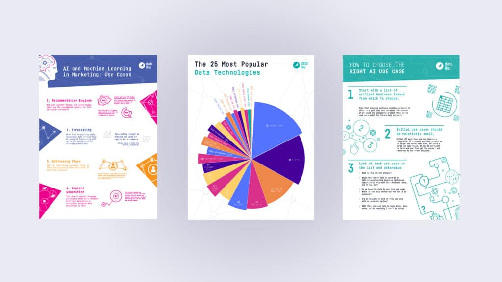
Use Graphics Wisely
While images are a great way to break up walls of text, they are also great tools for explaining a concept further.
You can show data in a way that’s easy to interpret using graphics. Humans understand information better with the help of visuals.
Use symbols, charts, infographics, illustrations, photos, and more to help lead the user’s attention to important parts of the page.
However, remember that too many graphics will not help your cause. It can add to the visual noise, making the whole thing confusing. If everything is a priority page, then nothing is a priority.
Only add relevant images and graphics. It will only get in the way if it doesn’t have relevance.
Add Some Interactive Elements
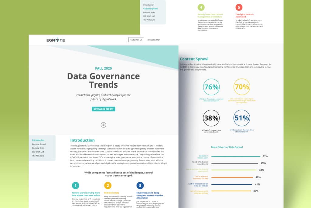
Embrace the full potential
of digital formats!
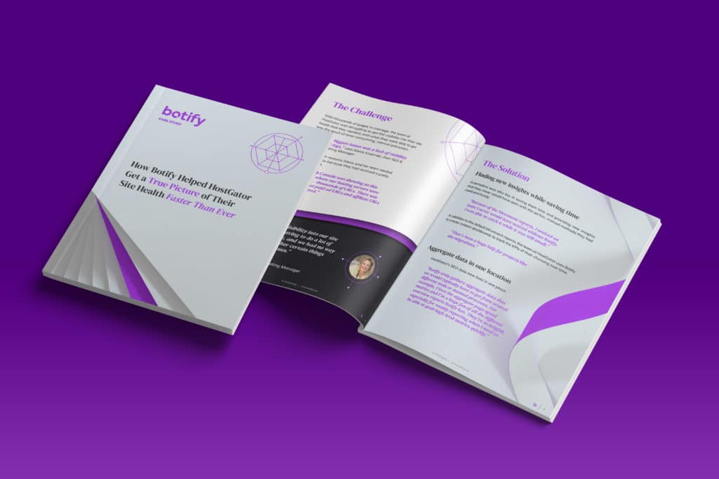
This is an interactive
White Paper we made
for Egnyte.com
Being viewed online allows
you to add animations, videos,
and so much more!
The whitepaper design aims to enhance the content and make it more engaging. Adding interactivity to make it even more interesting is one way to elevate this purpose.
This can be as simple as adding a clickable navigation menu somewhere on the first pages. Then, when users click a topic, they’ll get taken to the appropriate page.
PDFs allow you to add fillable fields and clickable buttons, which you can use as CTAs. More often than not, this type of content is viewed on a screen, so why limit yourself to a PDFs functionality? Like this very guide, there are so many benefits to making it as a web page, interactive elements aside, it is responsive so you can read it much easier on mobile devices!
Of course, all these wouldn’t work when printed, which leads us to our next tip.
Design for the Setting Your Audience Will Be In
Consider your audience when creating the layout. I have had many debates over the years about the perfect layout. Portrait or landscape, one column or multiple. Fully justified text or aligned. This also goes for file types. Producing white papers as PDFs has become somewhat of an industry standard. While this has many benefits, you should consider how the user will consume your content. For example, if you plan on professionally printing the White Paper to hand out at an event, that must be communicated at the start of the project. In addition, professional design requires different setups for printing vs. screens, the most apparent being RGB vs. CMYK colors.
If you try designing one item for all use cases, you get a mediocre experience everywhere.
The ideal is to make the content in multiple formats. This is less expensive and easier to execute than it sounds as long as there is a plan early in the production process.

Choose Classic Fonts
Countless font families and variations are available to add unique elements to your branded content. However, it would help if you stuck to the classics when producing long-form content.
Brands often force themselves into a corner with their font choices in brand guidelines, as what might look great on a website might give people a chronic migraine to read at length.
There is a reason why most book publishers, newspapers, and magazines use serif typefaces for body copy, and the same applies to white papers. Serifs – the tiny decorative strokes to each letter are more than cosmetic. These strokes make the letters distinct, so the human eye can easily recognize them by these strokes, making them much easier to read. Of course, you don’t have to use a serif font. The goal here is to keep readability in mind, which often means using tried and tested typefaces.
As typography is such a vast topic, I recommend reading some of the guides over at myfont.com, like this one on readability, for more info.
Don’t Add Multiple Topics to One Page
White papers are usually long, so don’t be afraid to add more pages when needed. Dedicating each page to a topic or concept will make the white paper more readable. It’s easier on the eyes and more engaging that way, too.
A simple way to do this is to ensure you don’t start a new idea on the same page. Instead, start the next section on another page; don’t worry, your readers know how to turn a page.
This will leave blank spaces for images and graphics, or you can leave it as is! There’s nothing wrong with some white space. It provides a welcome break for the eyes.
Own Your Identity
Your brand must be clear but not a distraction throughout the document. When adding infographics, for instance, don’t grab one from another source; create it yourself. Add your brand colors and stick to the theme.
Avoid white paper templates, as well. It can be tempting to use white paper design ideas from Google, but remember that everyone else has access to it, too. Dozens of other white papers might already be using whatever template you find.
It’s okay to look at some white paper examples to find inspiration. Still, your choice of typeface, colors, and everything else, in the end, must align with your identity.


A marketing specialist with 7+ years of experience developing, managing, and leading multiple projects. Chandra is constantly trying to learn and stay on top of new marketing trends.